1 A Recap on regression
Required packages
Load data
We will mostly work with a data set called grades, which contains four numerical variables:
     grade       GPA lecture nclicks
1 2.395139 1.1341088       6      88
2 3.665159 0.9708817       6      96
3 2.852750 3.3432350       6     123
4 1.359700 2.7595763       9      99
5 2.313335 1.0222222       4      66
For learning purposes, we will add two new variables: sport, which is categorical, and study_time which is numerical.
# create a categotical variable
grades$sport <- as.factor(rep(c("team",
                                "individual"),
                                each = 50))

# ensure reproducibility for the below simulation
set.seed(101301)

# create a variable "study_time" that is highly correlated with "grade"
grades$study_time <- 0.9 * grades$grade + rnorm(nrow(grades), mean = 6, sd = 1)

head(grades, 5)
grade GPA lecture nclicks sport study_time
1 2.395139 1.1341088 6 88 team 7.953380
2 3.665159 0.9708817 6 96 team 9.373033
3 2.852750 3.3432350 6 123 team 6.038151
4 1.359700 2.7595763 9 99 team 7.685146
5 2.313335 1.0222222 4 66 team 8.3815701.1 A brief recap: Simple linear regression
1.1.1 The model with one continuous predictor
A simple linear regression can be represented with the following equation:
\[ y = \beta_0 + \beta_{1}x_{1} + e \]
where:
\(y\): the dependent variable or outcome variable.
\(\beta_0\): the intercept is the predicted value of the dependent variable (\(y\)) when the independent variable or predictor (x) is 0. \(\beta_0\) represents the point where the regression line crosses the y-axis and it indicates the predicted value of \(\beta_0\) when the predictor is 0.
\(\beta_1\): the slope or regression coefficient quantifies the steepness of a line, representing the average change in the dependent variable \(y\) for a one-unit increase in the independent variable \(x\). \(\beta\) and the correlation coefficient between the \(x\) and \(y\) is directly related to one another. Mathematically, \(\beta_1\) can be computed as:
\[ \beta_1 = \rho_{xy} \cdot \frac{s_y}{s_x} \]
where \(s_y\) and \(s_x\) are the standard deviations for \(y\) and \(x\), respectively, and \(\rho_{xy}\) is the correlation between \(y\) and \(x\). In general, there is a larger effect of \(x\) on \(y\) when:
there is a higher correlation between \(x\) and \(y\);
there is more variation in \(y\) or numerator; or
there is less variation in \(x\) or denominator
\(\epsilon\): the error term also know as the residual. This represents the unexplained variance of \(y\) and summarizes the distance between the observed values \(y\) and the regression line (see Figure 1.1).
# fit a model
model <- lm(grade ~ study_time, grades)

# get predicted values
grades$predicted <- predict(model)

# Plot with residual lines
ggplot(grades, aes(x = study_time, y = grade)) +
  geom_point(color = "black") +
  geom_segment(aes(xend = study_time, yend = predicted), color = "gray") +
  geom_abline(intercept = coef(model)[[1]],
              slope = coef(model)[[2]],
              color = "blue") +
labs(x = "GPA", y = "Grade") 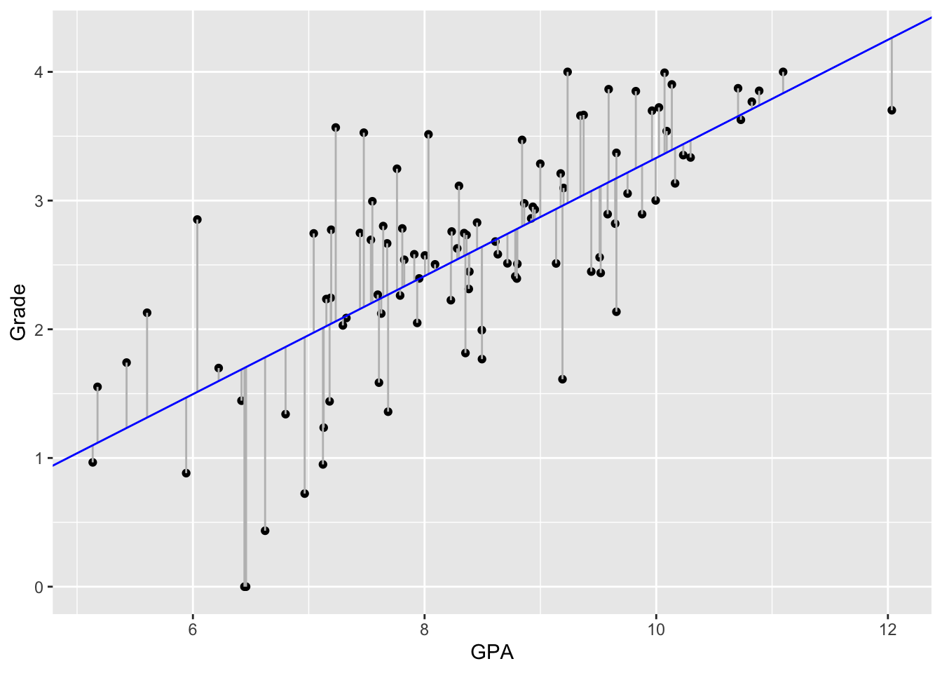
1.1.2 lm() function
In R, we can fit a linear regression with lm():
model <- lm(grade ~ study_time, grades)
model
Call:
lm(formula = grade ~ study_time, data = grades)

Coefficients:
(Intercept)   study_time
    -1.2586       0.4591
We can then plug in the parameter estimates into the regression formula:
grade = \(\beta_0\) + \(\beta_1\) * study_time
grade = -1.26 + 0.46 * 1
Thus, for each 1 point increase in study_time, the expected increase in grade would be:
[1] 0.461.1.3 Model summary
Running summary(), we obtain the following statistics:
summary(model)
Call:
lm(formula = grade ~ study_time, data = grades)

Residuals:
     Min       1Q   Median       3Q      Max
-1.70658 -0.33841  0.05309  0.40462  1.50599

Coefficients:
            Estimate Std. Error t value Pr(>|t|)
(Intercept) -1.25857    0.38345  -3.282  0.00143 **
study_time   0.45906    0.04503  10.194  < 2e-16 ***
---
Signif. codes:  0 '***' 0.001 '**' 0.01 '*' 0.05 '.' 0.1 ' ' 1

Residual standard error: 0.6232 on 98 degrees of freedom
Multiple R-squared:  0.5147,    Adjusted R-squared:  0.5097
F-statistic: 103.9 on 1 and 98 DF,  p-value: < 2.2e-16
# alternatively, we could run:
# model |> summary()Call: the formula and model used
Descriptive statistics of residuals
Statistics of intercepts and coefficient(s)
Model fit statistics
1.1.4 Model coefficients
We can also run tidy() in the broom package to get a neat table with the intercept and slope estimate, standard error, t-statistic, and p-value, all in a clear format:
tidy(model) |>
  kable(caption = "Coefficient estimates and statistics",
        format = "html",
        booktabs = TRUE,
        escape = TRUE) |>
kable_styling()| term | estimate | std.error | statistic | p.value |
|---|---|---|---|---|
| (Intercept) | -1.2585661 | 0.3834529 | -3.282192 | 0.001428 |
| study_time | 0.4590624 | 0.0450326 | 10.193995 | 0.000000 |
The test statistic and their corresponding p-value come from the t-test used to assess whether the intercept and b1 estimates are statistically different from 0.
We can also calculate 95% confidence intervals for each term of the regression model using confint():
confint(model) |>
    kable(format = "html",
          booktabs = TRUE,
          escape = TRUE) |>
kable_styling()| 2.5 % | 97.5 % | |
|---|---|---|
| (Intercept) | -2.0195159 | -0.4976163 |
| study_time | 0.3696966 | 0.5484282 |
We can also calculate the confidence intervals of the estimates using tidy() setting the argument conf.int = TRUE:
tidy(model, conf.int = TRUE) |>
    kable(format = "html",
          booktabs = TRUE,
          escape = TRUE) |>
kable_styling()| term | estimate | std.error | statistic | p.value | conf.low | conf.high |
|---|---|---|---|---|---|---|
| (Intercept) | -1.2585661 | 0.3834529 | -3.282192 | 0.001428 | -2.0195159 | -0.4976163 |
| study_time | 0.4590624 | 0.0450326 | 10.193995 | 0.000000 | 0.3696966 | 0.5484282 |
1.2 Assumptions
The validity of regression coefficients estimates, confidence intervals and significance tests depends on a number of assumptions:
1.2.1 Linearity
The model assumes the outcome is approximately the sum of the predictors each multiplied by some number. This implies a linear relationship between the outcome and each predictor when holding other predictors constant.
ggplot(grades, aes(study_time, grade)) +
  geom_point() +
  geom_smooth(method = "lm", se = FALSE)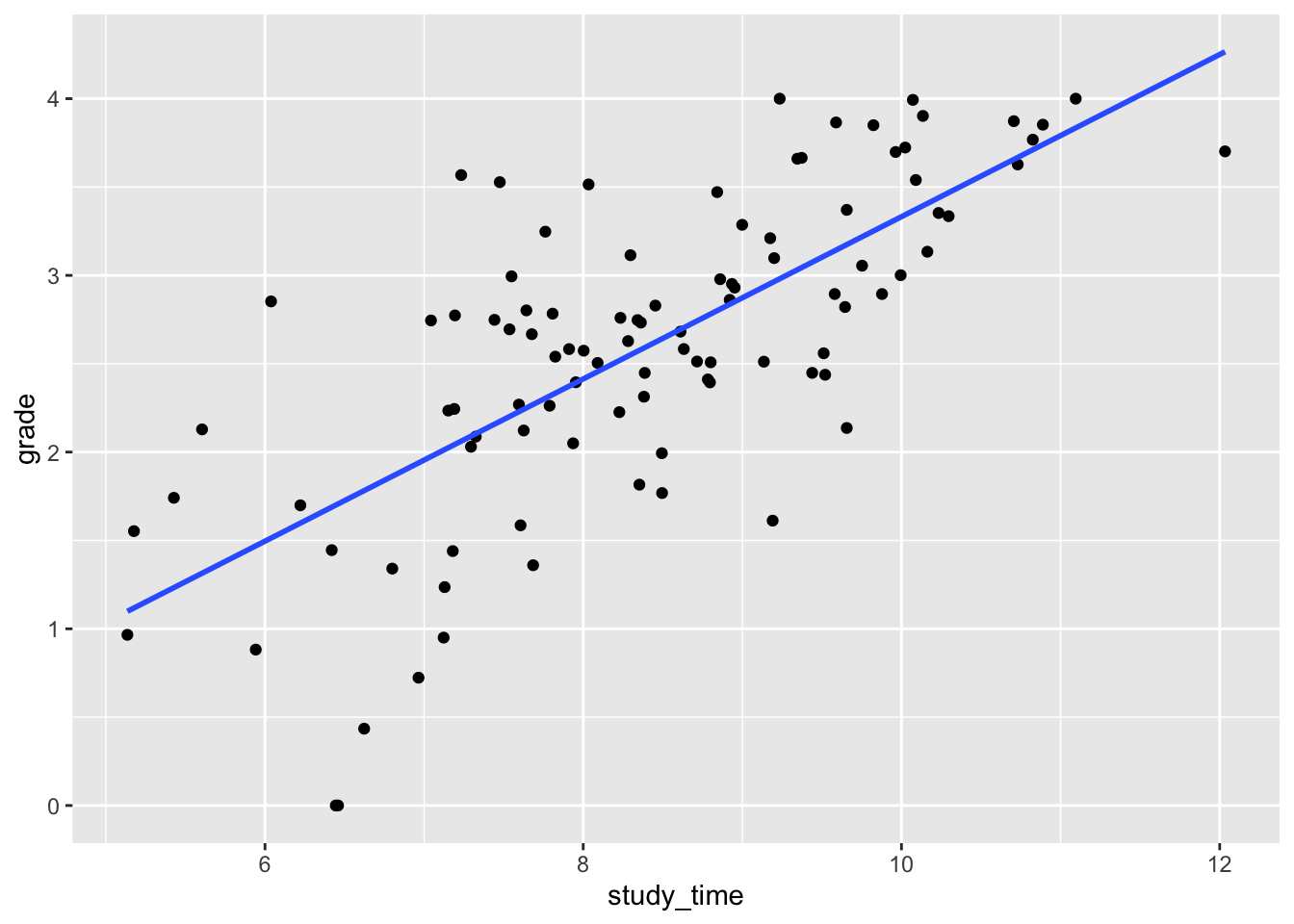
Alternatively, we can use plot() setting the argument which = 1:

Now let’s simulate non-linear data (see fig-non_linear):
set.seed(123) # for reproducibility

# simulate non-linear data
x <- seq(1, 50, length.out = 100)
y <- 10 * log(x) + rnorm(100, 10, 2)
df <- data.frame(x = x, y = y)

# Plot with smooth curve
ggplot(df, aes(x, y)) +
  geom_point() +
  geom_smooth(method = "lm", se = FALSE, colour = "red") +
geom_smooth(method = "loess", se = FALSE) 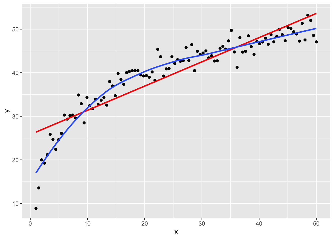
Alternatively, we can use plot() setting the argument which = 1:
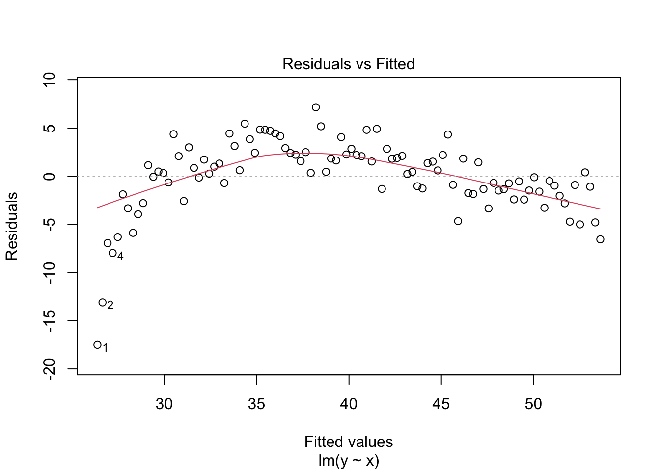
1.2.2 Independence of errors
This assumption is generally satisfied when data are collected through a simple random sample from a population. However, the independence assumption is violated when the data are clustered. For example, clustering occurs in longitudinal data, where repeated measures are taken from the same individual over time. Other common examples include patients clustered within hospitals or students clustered within schools. In such cases, observations within the same cluster tend to be more similar to each other than to those in other clusters, violating the assumption of independence. One common method to handle clustered data is the use of linear mixed models.
1.2.3 Normality of errors
The linear regression model assumes that the error terms are distributed according to a normal distribution denoted by
\[ \epsilon \sim N(0, \sigma^2). \]
where \(\epsilon\) represents the deviation of the \(i\)-th observation from the regression line and \(\sigma\) the variance of errors. Consequently, the residuals (the differences between observed data points and the regression line) are expected to follow a normal distribution with a mean of zero and constant variance.
We can either use plot() setting the argument which = 2 to plot a Q-Q residuals plot:
plot(model, which = 2)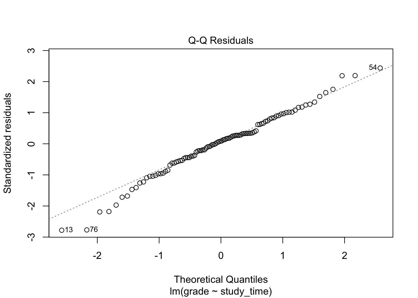
If residuals are normally distributed, the points will fall approximately on the dotted reference line.
Alternatively, we can simply use hist():
hist(model$residuals, breaks = 20, main = NULL, xlab = "Residuals")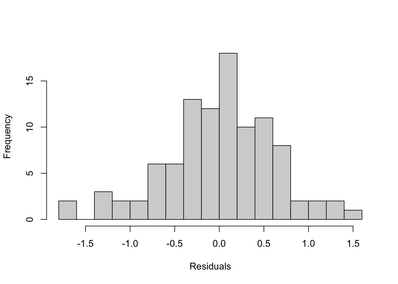
Both methods together give a good visual check of whether the residuals meet the normality assumption of linear regression.
We can formally test the normality using shapiro.test():
normality <- shapiro.test(model$residuals) |>
  tidy()

normality
# A tibble: 1 × 3
statistic p.value method
<dbl> <dbl> <chr>
1 0.985 0.316 Shapiro-Wilk normality testThe p-value is 0.316 which is above 0.05. Therefore, we fail to reject the null hypothesis of normality, indicating that residuals appear to follow a normal distribution.
1.2.4 Equal variance of errors
This assumption also known as homoscedasticity implies that the model assumes that the variance of the error terms is constant across all levels of the predictors. In other words, the spread of the residuals should remain roughly the same regardless of the value of the predictors.
To test the assumption of homoscedasticity (constant variance of residuals) in linear regression, you have several approaches in R:
plot(model, which = 1)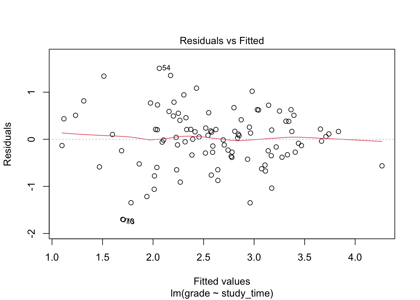
Residuals should be randomly scattered around 0. A funnel shape (wider spread at high or low fitted values) indicates heteroscedasticity.
plot(model, which = 3)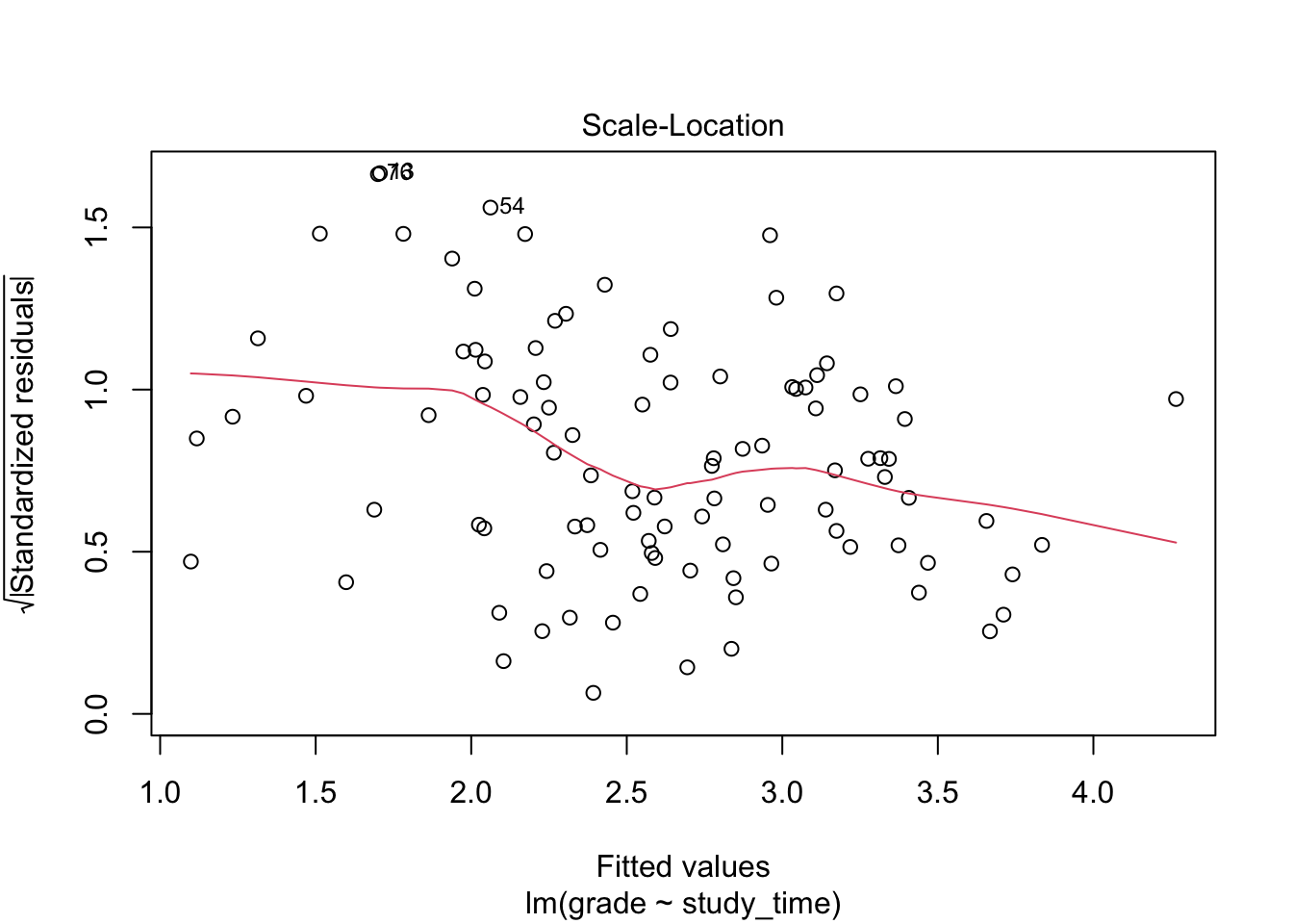
A horizontal line indicates homoscedasticity; a trend indicates heteroscedasticity.
We can formally test homoscedasticity using lmtest::bptest():
lmtest::bptest(model)
    studentized Breusch-Pagan test

data:  model
BP = 10.382, df = 1, p-value = 0.001273
The test indicates that we can reject the assumption of homoscedasticity.
1.2.5 Outliers
Outliers are observed data points that deviate markedly from the overall pattern of the data and can have a strong influence on the fitted model. They may arise due to errors in data collection, measurement mistakes, or sampling variability. Identifying and assessing outliers is important because they can disproportionately affect model estimates and conclusions.
# for reproducibility
set.seed(0001)

# simulate data
df <- data.frame(
  y = c(rnorm(25, 7, 3), rnorm(25, 6, 3)),
  x = rep(c("treatment", "control"), each = 25)
)

# plot the data
ggplot(df, aes(x, y)) +
  geom_boxplot()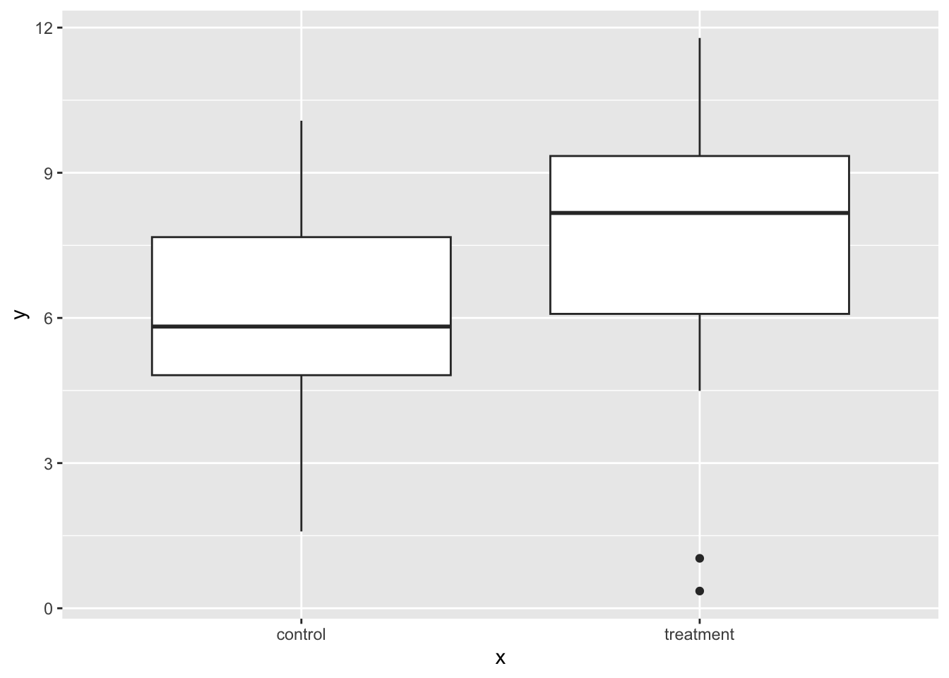
Now fit the model:
 model <- lm(y ~ x, df)

 model |>
  tidy() |>
  mutate(p_value = format(p.value, scientific = FALSE)) |>
  select(-p.value)
# A tibble: 2 × 5
term estimate std.error statistic p_value
<chr> <dbl> <dbl> <dbl> <chr>
1 (Intercept) 6.10 0.502 12.1 0.0000000000000003079448
2 xtreatment 1.41 0.710 1.98 0.0529855435773197505633Now let’s add an outlier:
# replace data point in row 10 column ''y''
df$y[[10]] <- 25

# plot the data
ggplot(df, aes(x, y)) +
  geom_boxplot()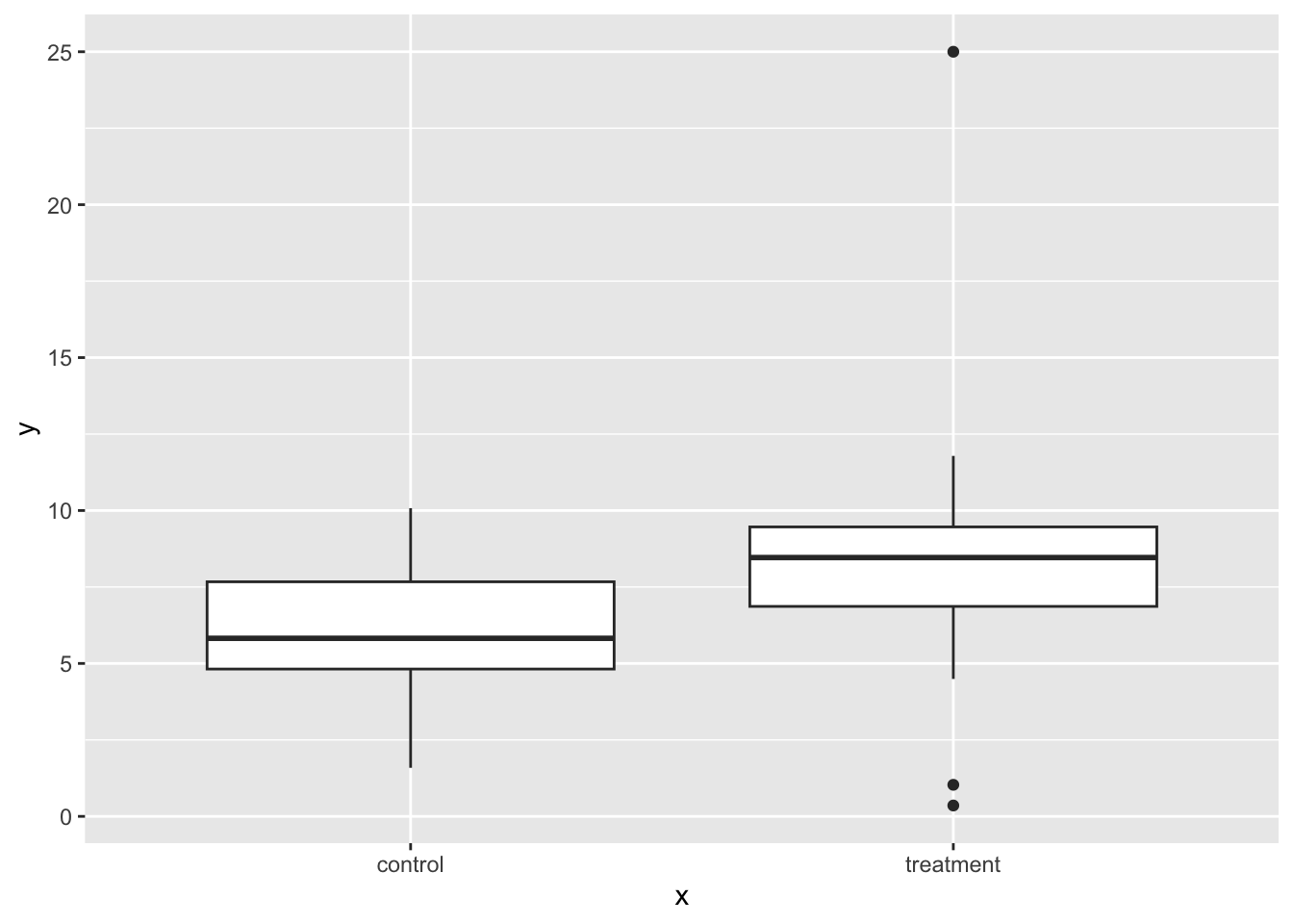
Then let’s refit the model with the outlier:
lm(y ~ x, df)  |>
  tidy() |>
  mutate(p_value = format(p.value, scientific = FALSE)) |>
  select(-p.value)
# A tibble: 2 × 5
term estimate std.error statistic p_value
<chr> <dbl> <dbl> <dbl> <chr>
1 (Intercept) 6.10 0.703 8.68 0.0000000000213027
2 xtreatment 2.17 0.994 2.18 0.0342145484966231Note the impact of the outlier on the estimate its p-value.
Let’s run some diagnostics:
plot(model, which = 4)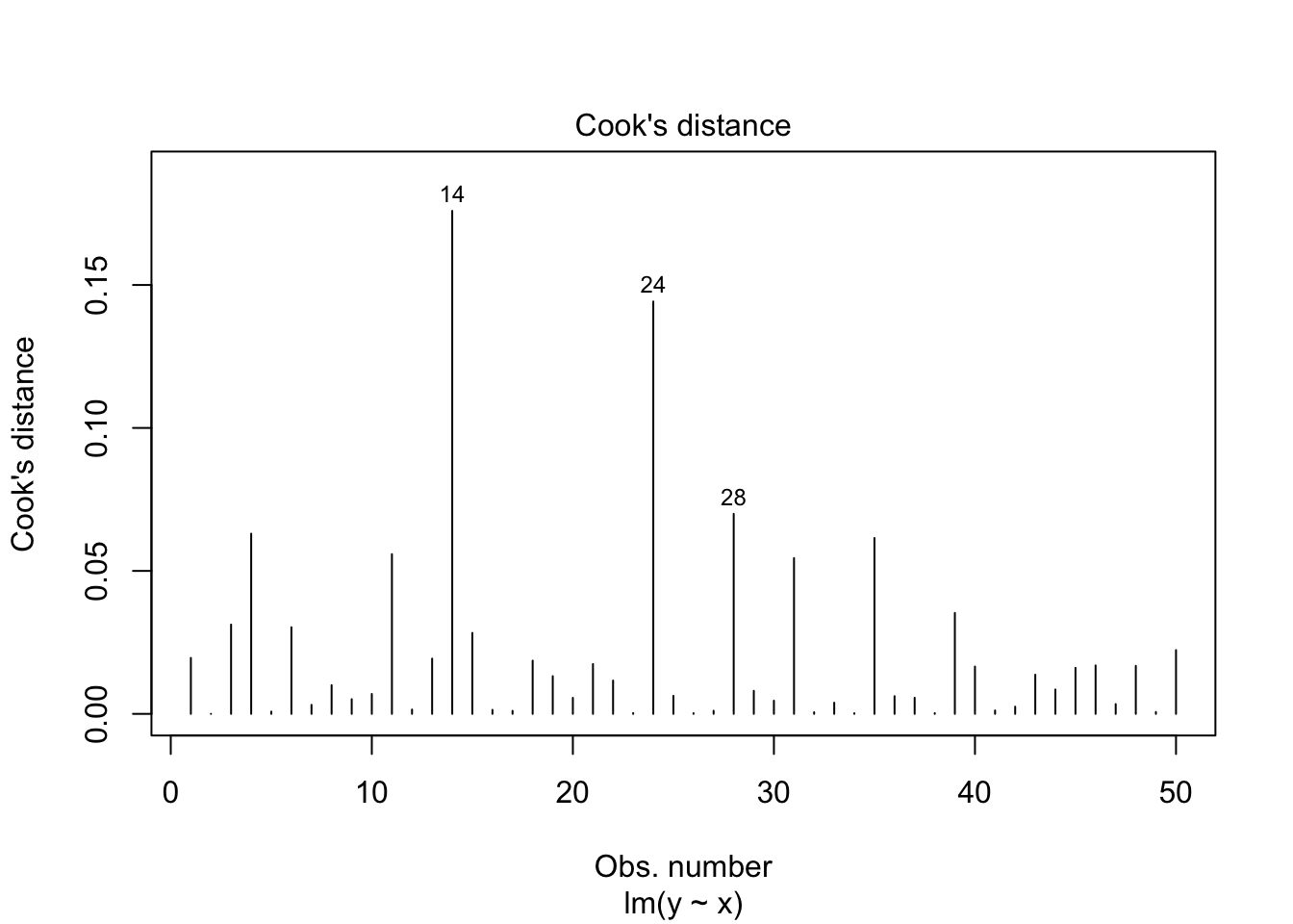
plot(model, which = 5)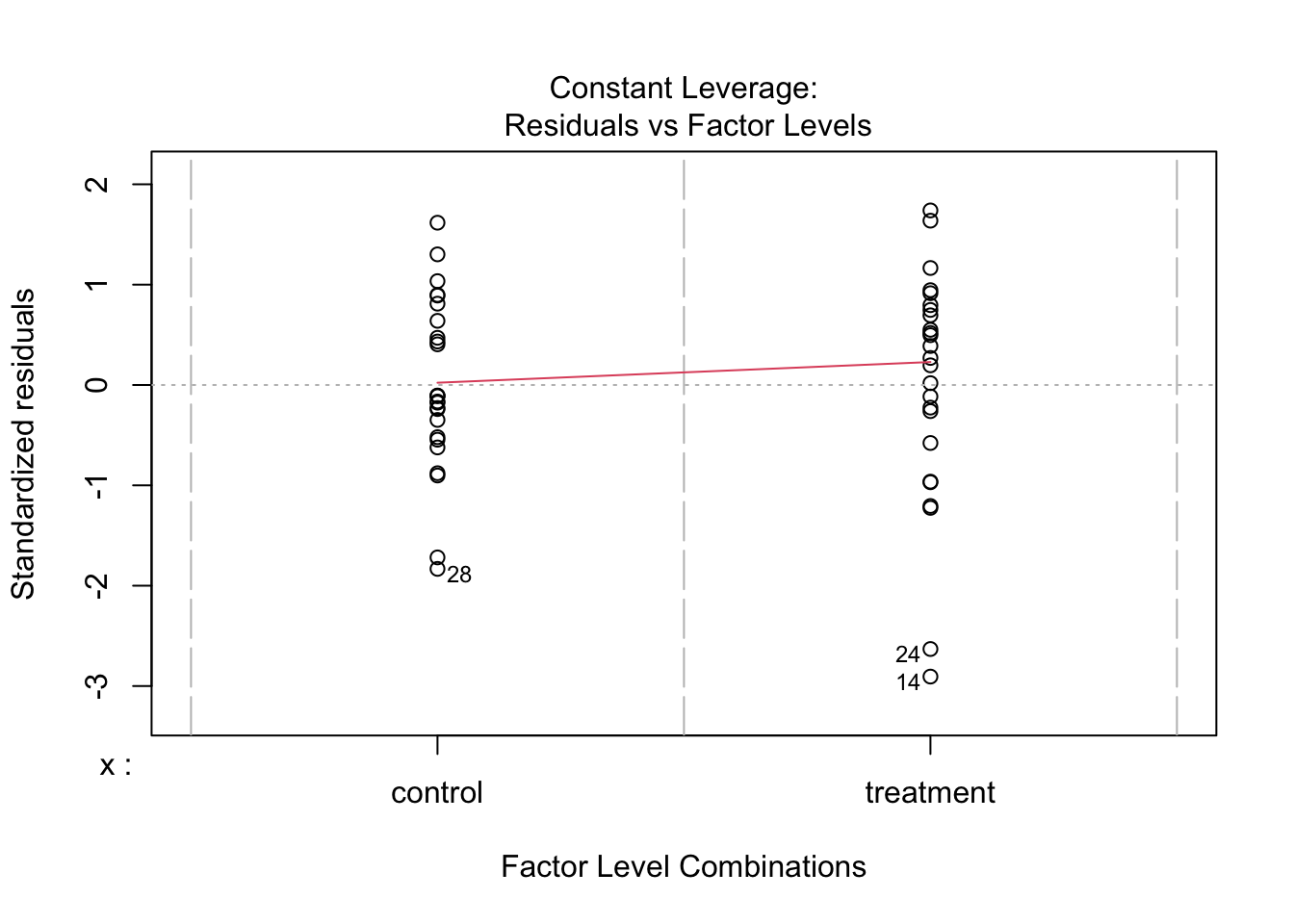
What should we do with outliers?
Removing outliers can be a valid strategy if they represent errors. Ideally one would report results with and without outliers to see the extent of their impact on results. Ensure your data cleaning process is well-documented and reproducible. This approach, however, can reduce statistical power. Not all outliers should be removed. Consider the context and reason for their existence.
1.2.6 Collinearity
It refers to the degree of correlation between predictor variables in a regression model. It becomes a concern in multiple linear regression, where two or more predictors are included. If predictors are highly correlated with each other, this makes it hard for the model to estimate the effect of each predictor separately.
# Create the first predictor
x1 <- rnorm(50, mean = 50, sd = 10)

# Create the second predictor correlated with x1
x2 <- 0.5 * x1 + rnorm(50, mean = 0, sd = 2)

# simulate the outcome
y <- 5 + 0.6 * x1 + 0.4 * x2 + rnorm(50, mean = 0, sd = 10)

# Combine into a data frame
sim_data <- data.frame(
  x1 = x1,
  x2 = x2,
  y = y
)

# Check correlation
cor(sim_data$x1, sim_data$x2)
[1] 0.9375614This correlation shows that x1 and x2 are highly correlated, indicating potential multicollinearity. Including both predictors does not increase R².
model1 <- lm(y ~ x1, sim_data)
model2 <- lm(y ~ x1 + x2, sim_data)

data.frame(
  model = c("model1", "model2"),
  R2 = c(summary(model1)$r.squared, summary(model2)$r.squared)
)
model R2
1 model1 0.3488140
2 model2 0.4009539Adding a second predictor does not significantly improve the model fit, as shown by the ANOVA comparison:
anova(model1, model2)Analysis of Variance Table
Model 1: y ~ x1
Model 2: y ~ x1 + x2
Res.Df RSS Df Sum of Sq F Pr(>F)
1 48 5162.0
2 47 4748.7 1 413.32 4.0908 0.04883 *
---
Signif. codes: 0 '***' 0.001 '**' 0.01 '*' 0.05 '.' 0.1 ' ' 1We can also assess multicolinearity with the The Variance Inflation Factor (VIF) which measures multicollinearity in multiple regression, and is calculated using car::vif():
vif(model2) x1 x2
8.26592 8.26592 While there are no hard and fast rules for detecting multicollinearity: VIF values above 10 or 5 are commonly used as thresholds for identifying multicollinearity.
1.3 Multiple linear regression
In simple linear regression, we model the relationship between one predictor and one outcome, such as predicting exam score from hours studied, while in multiple linear regression, we use two or more predictors (which can be continuous or categorical) to explain variation in the outcome. This allows us to estimate the unique effect of each predictor while controlling for others, and it also makes it possible to include interaction terms, where the effect of one predictor (e.g., a continuous variable like hours studied) depends on the level of another predictor (e.g., a categorical variable like teaching method).
With two predictor variables (\(x_1\)) and (\(x_2\)) the prediction of \(y\) is expressed by the following equation:
\[ y = \beta_0 + \beta_{1}X_{1} + \beta_{2}X_{2} + e \]
where the \(\beta_1\) and \(\beta_2\) measure the association between \(x_1\) and \(x_2\) and \(y\). Specifically, \(\beta_1\) is interpreted as the average effect of a one unit increase in \(x_1\) on \(y\), holding the other predictors constant, and \(\beta_2\) is interpreted similarly for \(x_2\).
When adding a second predictor (\(x_2\)):
If \(x_2\) is a continuous predictor (e.g., nclicks), the corresponding regression coefficient (b1) is a slope, interpreted as the difference in the mean of y associated with a one-unit difference in x when holding all other predictors fixed (or “controlling for” or “adjusted for” the other predictors).
If \(x_2\) is a categorical predictor (e.g., sex) with L levels, then instead of just one corresponding \(x\) term in the model, there are L-1 indicator variables. Each of the L-1 corresponding regression coefficients is interpreted as the difference between the mean of \(y\) at that level of \(x\) and the mean of \(y\) at the reference level, when holding all other predictors fixed (or “controlling for” or “adjusted for” the other predictors).
When we talk about “controlling for” or “adjusted for” what we are saying is that by adding a second predictor (x2) in the model, we statistically hold the values of x2 constant. That is to say:
No changes in \(y\) can be attributed to changes in \(x_2\)
Since the value of \(x_2\) is being held constant, the only remaining source of change in \(y\) is a change in \(x_1\)
1.3.1 Model with two continuous predictors
Suppose we want to examine how GPA and access to Canvas affect grades, we can fit a multiple regression model using the data set:
head(grades, n = 5) grade GPA lecture nclicks sport study_time predicted
1 2.395139 1.1341088 6 88 team 7.953380 2.392532
2 3.665159 0.9708817 6 96 team 9.373033 3.044241
3 2.852750 3.3432350 6 123 team 6.038151 1.513322
4 1.359700 2.7595763 9 99 team 7.685146 2.269395
5 2.313335 1.0222222 4 66 team 8.381570 2.589098Let’s fit a regression model with the predictors GPA and nclicks:
# A tibble: 3 × 5
  term        estimate std.error statistic p.value
  <chr>          <dbl>     <dbl>     <dbl>   <dbl>
1 (Intercept)  1.52      0.564       2.69  0.00842
2 GPA          0.219     0.102       2.15  0.0344
3 nclicks      0.00564   0.00590     0.957 0.341
Given the output, our regression model equation with two predictors can be written as follow:
grade = 1.52 + 0.22*GPA + 0.01*nclicks
grade increases by 0.22 as GPA increases by one point while holiding nclicks constant. The regression coefficient of GPA is statistically significant (p = 0.0343807) indicating that is statistically different from 0. The regression coefficient of nclicks term has a value of 0.01. grade increases by 0.0056 as nclicks` increases by 1 while holding GPA constant. Unlike GPA, the regression coefficient of nclicks is not statistically significant (p = 0.341085) indicating that is not statistically different from 0.
When we say “holding nclicks constant”, we mean that the effect of GPA is estimated while comparing student with the same number of clicks. For instance, suppose we want to compare two students with the same number of clicks (i.e., holding nclicks constant):
Both students have 50 clicks, but different GPAs:
-
Student A: GPA = 3
-
Student B: GPA = 4
The difference in grade between both students is the effect of a 1-point GPA increase at the same number of clicks. That’s all “holding constant” means: compare outcomes at the same value of the other variable.
1.3.2 Model with one continuous and one categorical predictor
head(grades) grade GPA lecture nclicks sport study_time predicted
1 2.395139 1.1341088 6 88 team 7.953380 2.392532
2 3.665159 0.9708817 6 96 team 9.373033 3.044241
3 2.852750 3.3432350 6 123 team 6.038151 1.513322
4 1.359700 2.7595763 9 99 team 7.685146 2.269395
5 2.313335 1.0222222 4 66 team 8.381570 2.589098
6 2.582859 0.8413324 8 99 team 7.911008 2.373080The variable sport is categorical with two levels (team and individual). Now suppose that we want to determine whether lecture and sport affect grade:
| term | estimate | std.error | statistic | p.value |
|---|---|---|---|---|
| (Intercept) | 1.914 | 0.323 | 5.930 | 0.000 |
| lecture | 0.105 | 0.043 | 2.467 | 0.015 |
| sportteam | -0.105 | 0.174 | -0.602 | 0.548 |
In the fitted model, teamis used as the reference category. As a result, the model includes one coefficient representing the difference in the outcome variable between team and individual. The intercept corresponds to the expected value of grade when x is the student plays an individual sport.
When using regression models, by default R treats the first level of a categorical factor (alphabetically or numerically) as the reference level in regression models . This is why indiviudal is treated as the reference level. This default behavior can be changed using three methods.
- Dummy coding
Dummy coding is the process of converting categorical variables into numeric variables (e.g., 0, 1, 2) so they can be included in regression models. This allows the model to estimate differences between categories.
For example, suppose we want to include the variable sport (team vs. individual) in a regression. We can create a dummy variable as follows:
grades_dummy <- grades |>
  mutate(sport_dummy = as.factor(if_else(sport == "team", 0, 1)))

head(grades_dummy, 5)
grade GPA lecture nclicks sport study_time predicted sport_dummy
1 2.395139 1.1341088 6 88 team 7.953380 2.392532 0
2 3.665159 0.9708817 6 96 team 9.373033 3.044241 0
3 2.852750 3.3432350 6 123 team 6.038151 1.513322 0
4 1.359700 2.7595763 9 99 team 7.685146 2.269395 0
5 2.313335 1.0222222 4 66 team 8.381570 2.589098 0Here team is coded as 0 and will be the reference category (intercept ) whereas individual is coded as 1 and its coefficient in the regression will represent the difference from the reference category. Let’s fit the model:
# A tibble: 3 × 5
  term        estimate std.error statistic  p.value
  <chr>          <dbl>     <dbl>     <dbl>    <dbl>
1 (Intercept)   2.05      0.269      7.63  1.63e-11
2 GPA           0.246     0.0978     2.52  1.35e- 2
3 sportteam    -0.0835    0.174     -0.480 6.33e- 1
Now the reference level is team because it corresponds to the first level of the factor, which in this case is 0. By convention, the reference level is often assigned the value 0 when encoding categorical variables numerically.
- Using
factor()
We can reorder the levels of the factor to specify which level we want to the the reference level.
We then fit the model:
# A tibble: 3 × 5
  term            estimate std.error statistic  p.value
  <chr>              <dbl>     <dbl>     <dbl>    <dbl>
1 (Intercept)       1.97      0.262      7.51  2.93e-11
2 GPA               0.246     0.0978     2.52  1.35e- 2
3 sportindividual 0.0835 0.174 0.480 6.33e- 1- Using
relevel()
relevel() allows you to change the reference level without having to reorder the entire factor.
grades$sport <- relevel(grades$sport, ref = "team")We fit the model again:
1.3.3 Model with an interaction effect between two predictors
An interaction effect occurs when the effect of one predictor variable on the outcome depends on the level or value of another predictor. In other words, the relationship between \(y\) and \(x_1\) changes depending on \(x_2\)
The model with interaction effects between two predictors can be written as follows:
\[ y = b_0 + b_{1}X_{1} + b_{2}X_{2} + b_{3}X_{1}X_{2} + e \]
In the interaction model, if b3 is zero, the equation reduces to the equation for the main-effects model, namely:
\[ y = b_0 + b_{1}X_{1} + b_{2}X_{2} + e \]
1.3.4 Interaction between a two categorical predictors
Suppose we want to determine whether the efficacy of a new drug to reduce blood pressure (BP) is improved by the presence of a second moderator or predictor. Specifically, we are interested in whether the efficacy of the drug to reduce blood pressure is higher in patients that do exercise in comparison to those who are sedentary. This would be an example of a study where the effect of interest is an interaction effect.
Example 1
Let’s simulate data for a 2 x 2 factorial design
# For reproducibility
set.seed(040404)

# Define the design
design <- list(
  treatment = c("placebo", "drug"),
  sport = c("yes", "no")
)

# Define the means for each condition
mu <- c(57, 60, 37, 41)

# Simulate the data
sim_data <- sim_design(
  between = design,
  dv = "BP",
  mu = mu,
  n = 30,  # Number of participants per condition
  sd = 5,  # Standard deviation
  long = TRUE,
  plot = FALSE
)
Plot the simulated data:
ggplot(sim_data, aes(x = treatment, y = BP, group = sport, color = sport)) +
  stat_summary(fun = mean, geom = "line", size = 1.2) +
  stat_summary(fun = mean, geom = "point", size = 3) +
  coord_cartesian(ylim = c(30, 80)) +
  labs(y = "Blood pressure", x = "Treatment")
Warning: Using `size` aesthetic for lines was deprecated in ggplot2 3.4.0.
ℹ Please use `linewidth` instead.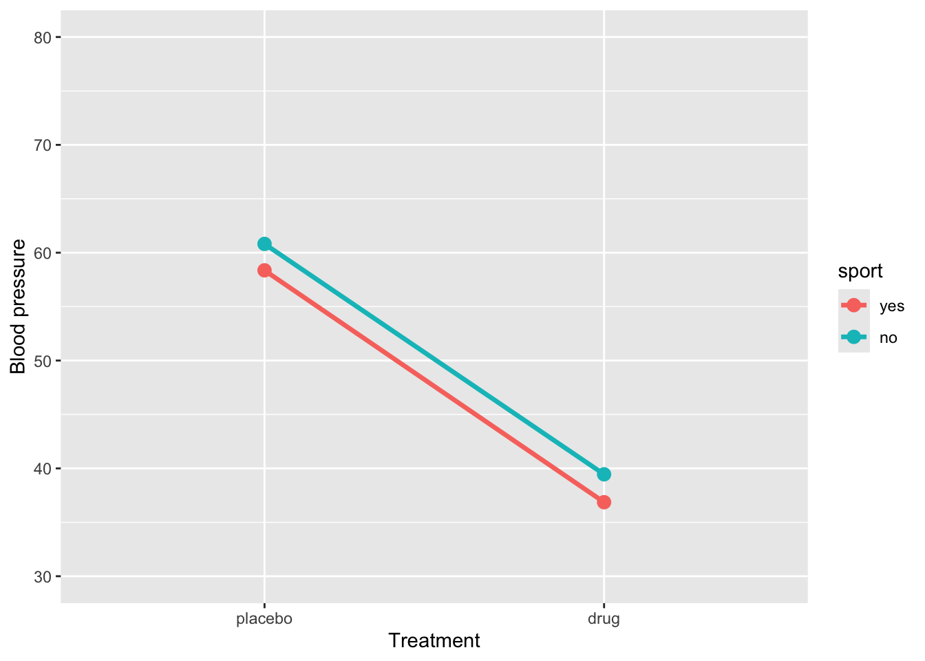
Fit the model with an interaction effect:
res1 <- lm(BP ~ treatment * sport, data = sim_data) |>
  tidy() |>
  mutate(
    p_value = as.numeric(formatC(p.value, format = "f", digits = 4)
  )) |>
  select(-p.value)

res1
# A tibble: 4 × 5
term estimate std.error statistic p_value
<chr> <dbl> <dbl> <dbl> <dbl>
1 (Intercept) 58.4 0.847 68.9 0
2 treatmentdrug -21.5 1.20 -18.0 0
3 sportno 2.45 1.20 2.05 0.043
4 treatmentdrug:sportno 0.135 1.69 0.0799 0.936The regression model shows that BP for the reference group (placebo and sport = yes) is 58.37. When sport = yes, taking the drug reduces BP by approximately -21.5units, a highly significant effect. Being in sport = no significantly increases BP (2.45) in the placebo group. The interaction between treatment and sport (0.14) indicates that the drug’s effect is slightly smaller for sport = no, but this difference is not statistically significant. Overall, the drug substantially reduces BP regardless of sport participation, and there is no meaningful interaction, so the effect of the drug is similar across both sport groups.
Example 2
# For reproducibility
set.seed(123)

# Define the design
design <- list(
  treatment = c("placebo", "drug"),
  sport = c("yes", "no")
)

# Define the means for each condition
mu <- c(38, 40, 38, 40)

# Simulate the data
sim_data2 <- sim_design(
  between = design,
  dv = "BP",
  mu = mu,
  n = 30,  # Number of participants per condition
  sd = 5,  # Standard deviation
  long = TRUE,
  plot = FALSE
)ggplot(sim_data2, aes(x = treatment, y = BP, group = sport, color = sport)) +
stat_summary(fun = mean, geom = "line", size = 1.2) +
stat_summary(fun = mean, geom = "point", size = 3) +
coord_cartesian(ylim = c(30, 50)) +
labs(y = "Mood", x = "Treatment")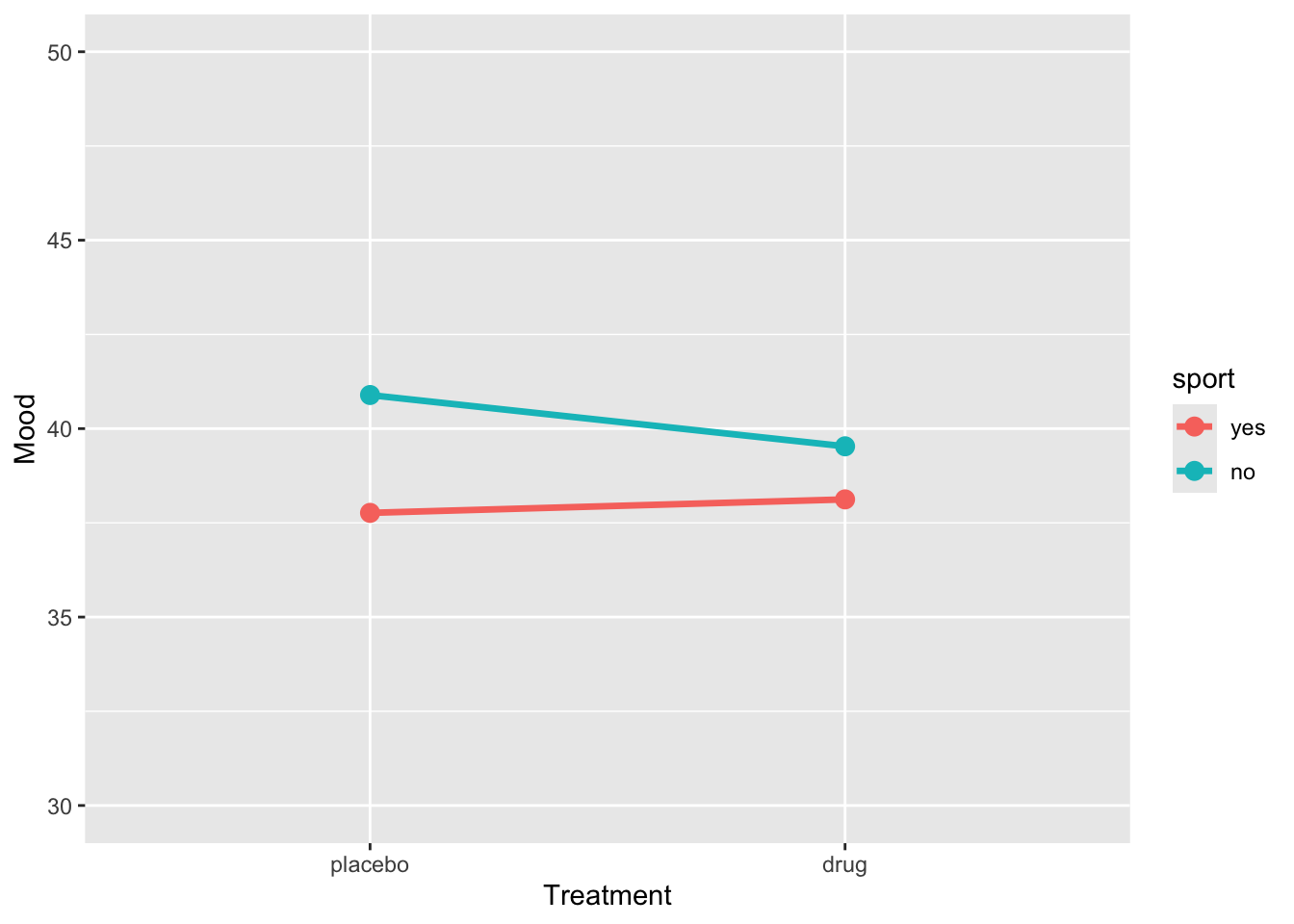
res2 <- lm(BP ~ treatment * sport, data = sim_data) |>
  tidy() |>
  mutate(
    p_value = as.numeric(formatC(p.value, format = "f", digits = 4)
  )) |>
  select(-p.value)

res2
# A tibble: 4 × 5
term estimate std.error statistic p_value
<chr> <dbl> <dbl> <dbl> <dbl>
1 (Intercept) 58.4 0.847 68.9 0
2 treatmentdrug -21.5 1.20 -18.0 0
3 sportno 2.45 1.20 2.05 0.043
4 treatmentdrug:sportno 0.135 1.69 0.0799 0.936Example 3
# For reproducibility
set.seed(123)

# Define the design
design <- list(
  treatment = c("placebo", "drug"),
  sport = c("yes", "no")
)

# Define the means for each condition
mu <- c(55, 62, 40, 55)

# Simulate the data
sim_data3 <- sim_design(
  between = design,
  dv = "BP",
  mu = mu,
  n = 30,  # Number of participants per condition
  sd = 5,  # Standard deviation
  long = TRUE,
  plot = FALSE
)
Let’s plot the data
ggplot(sim_data3, aes(x = treatment, y = BP, group = sport, color = sport)) +
  stat_summary(fun = mean, geom = "line", size = 1.2) +
  stat_summary(fun = mean, geom = "point", size = 3) +
  coord_cartesian(ylim = c(30, 80)) +
  labs(y = "Blood pressure", x = "Treatment")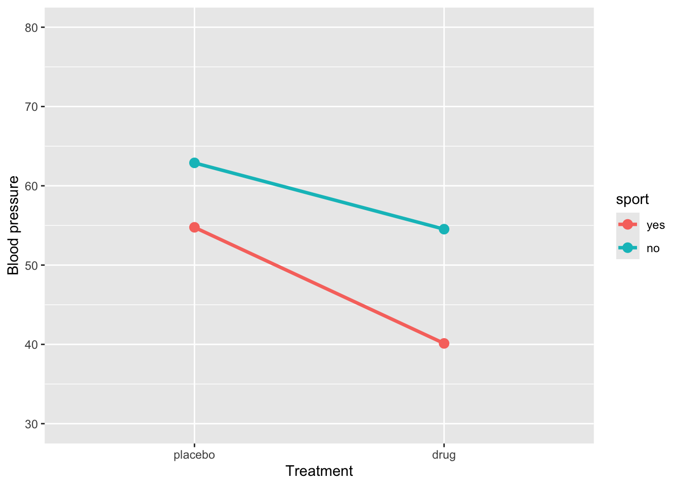
Let’s fit the model
# A tibble: 4 × 5
  term                  estimate std.error statistic  p.value
  <chr>                    <dbl>     <dbl>     <dbl>    <dbl>
1 (Intercept)              54.8      0.821     66.7  2.45e-94
2 treatmentdrug           -14.6      1.16     -12.6  1.80e-23
3 sportno                   8.13     1.16       7.00 1.81e-10
4 treatmentdrug:sportno     6.28     1.64       3.82 2.13e- 4
How to interpret this output:
(Intercept)= 54.8: This is the estimated mean blood pressure for subjects in the placebo group who are active.-
treatmentdrug= -14.6: This represents the change in blood pressure for subjects who are in the drug treatment and are active. Their blood pressure is:54.8 + -14.6 =
40.1
-
sportno= 8.1: This represents the change in blood pressure for subjects in placebo group and are sedentary. Their blood pressure is:54.8 + 8.1 =
62.9
-
treatmentdrug:sportno= 6.3: This is the interaction effect: the additional change in blood pressure for subjects who are sedentary and in the drug group. So, their expected blood pressure is:54.8 + (-14.6) + 8.1 + 6.3 =
54.5
An interaction effect occurs when the effect of one predictor varies depending on the level of another predictor. Graphically, this is shown when the lines representing different groups are not parallel. Conversely, parallel lines typically indicate the absence of an interaction, meaning the effect of one predictor is consistent across the levels of the other.
1.3.5 Interaction between a continuous and categorical predictors
Suppose we want to determine whether the effect of GPA on grade differs between students who play “team sports” and those who play “individual sports”. Specifically, we aim to compare whether the effect of GPA on grade varies as a function of sport.
ggplot(grades, aes(y = grade, x = GPA, colour = sport)) +
  geom_point() +
  geom_smooth(method = "lm", se = FALSE)
`geom_smooth()` using formula = 'y ~ x'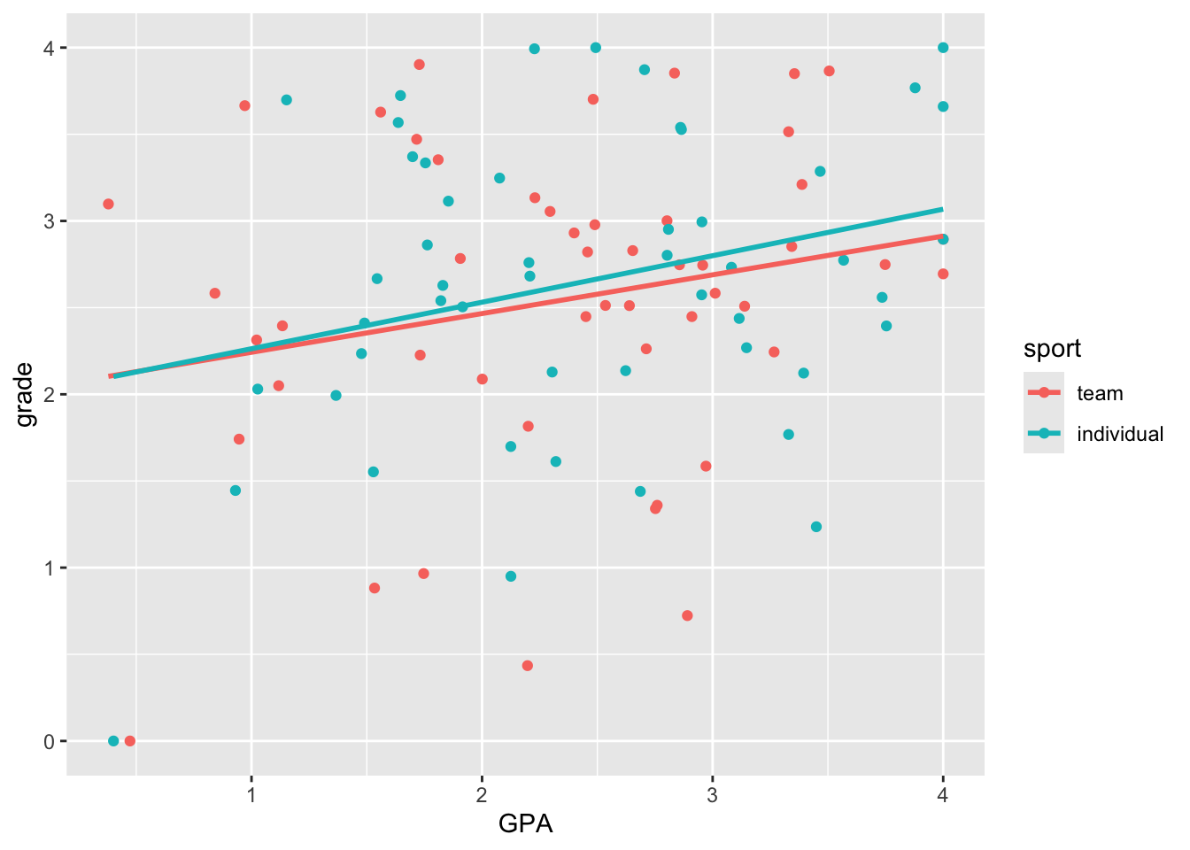
Here we see very clearly the difference in slope that we built into our data. How do we test whether the two slopes are significantly different? To do this, we can’t have two separate regressions. We need to bring the two regression lines into the same model. How do we do this?
lm(grade ~ GPA + sport + GPA*sport, grades) |>
  tidy() |>
  mutate(p.value = format.pval(p.value, digits = 3, scientific = FALSE)) |>
  kable() |>
kable_styling()| term | estimate | std.error | statistic | p.value |
|---|---|---|---|---|
| (Intercept) | 2.0187700 | 0.3520472 | 5.7343736 | 0.000000113 |
| GPA | 0.2234913 | 0.1394717 | 1.6024138 | 0.112 |
| sportindividual | -0.0241565 | 0.5034438 | -0.0479826 | 0.962 |
| GPA:sportindividual | 0.0448184 | 0.1965006 | 0.2280829 | 0.820 |